• 🏆 Texturing Contest #33 is OPEN! Contestants must re-texture a SD unit model found in-game (Warcraft 3 Classic), recreating the unit into a peaceful NPC version. 🔗Click here to enter!
  • It's time for the first HD Modeling Contest of 2024. Join the theme discussion for Hive's HD Modeling Contest #6! Click here to post your idea!

Revan(Rom)´s terrainshowcase

Status
Not open for further replies.
Level 10
Joined
Aug 10, 2007
Messages
224
Well..here some pics.....
 

Attachments

  • Horror Lightning.JPG
    Horror Lightning.JPG
    159.4 KB · Views: 191
  • Outland.jpg
    Outland.jpg
    62.3 KB · Views: 136
Last edited:
Level 18
Joined
Aug 3, 2008
Messages
1,935
hmm id have to agree wit gillez.

the sky and the fog would be the best parts of this...

the buildiings are a bit fugly. maybe. even high rez lookz better than those building s ( duh maybe i dont know xD )

but itz deccent. better than som of the dumb crap that gets on the threads... som of them hurt my eyes. this one didn't .
 
Level 34
Joined
Sep 6, 2006
Messages
8,873
Well I generally avoid talking about high-res since I don't care for them.

Your tile variation could use some work, and that grass tile is the ugliest in wc3. I'd go with an ashenvale or something. It's a bit flat, although not all landscapes need height I suppose. I don't like how random and bare the shrubs look. They should have other doodads with them often.

Good tree variation though, and decent atmosphere.
 
Level 18
Joined
Aug 3, 2008
Messages
1,935
lol xD

i know he or she ( revan rom's a guy right ... his/her avatar iz thrownin me off xD)
is using the UTM. i waz just comparing the two. cause i dont know anyother good buildings in the UTM...

ya but still, i like this pic, forget high rez, even though i think its awsome >.>
 
Level 18
Joined
Aug 3, 2008
Messages
1,935
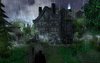
hmm new pic looks cool. problemz though

the background is being messed up by that nasty Wind. get rid of it. and put in a better Fog.

then add more things to the foreground, like more rocks, and stuff.

lastly fix the mountain, it ends before the picture ends, creating an end of the world look, which is ugly. Extend the edges of the mountain to hide the end of the world.

The atmosphere ( the clouds and sky and the moon ) look really good with the color scheme. fix it up and itll look wayy better.
 
Status
Not open for further replies.
Top