🏆 Texturing Contest #33 is OPEN! Contestants must re-texture a SD unit model found in-game (Warcraft 3 Classic), recreating the unit into a peaceful NPC version. 🔗Click here to enter!
It's time for the first HD Modeling Contest of 2024. Join the theme discussion for Hive's HD Modeling Contest #6! Click here to post your idea!
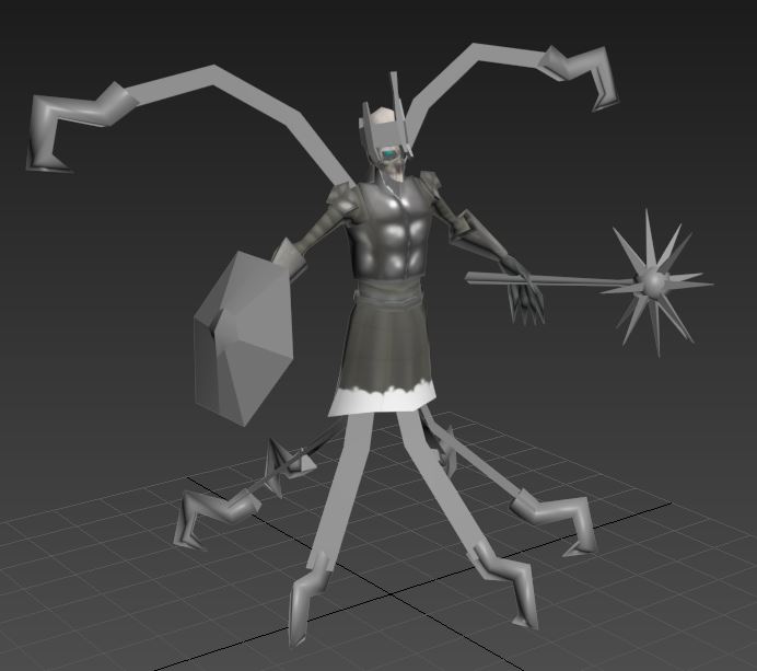
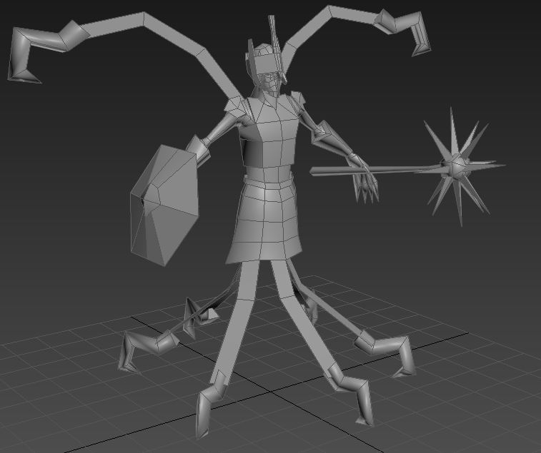
Alright, here is the actual finished mesh. Hope you all like it. You're a tough crowd to please. I added a crown to his head and changed his weapon.
Also, this mesh is now fully unwrapped. It's too late to make any major changes, but I can fit one more object into one of the two UV textures if someone has a great idea for an addition.
I don't have an official name for him now. Lets all refer to him as the "Necromancer death king warrior mage."
"Tough crowd to please"? Nonsense. We're merely trying to help you become the best you can be.
Also, I want you to make things that I can use. Totally selfish motives, here. xD
Anyway, I have to admit, it's looking a lot better; the crown actually adds a tangible "something" to it. I still have some strong opinions about the hooks (and the shield... and the mace... and the proportions), but ultimately it's your creation. I'm interested to see what happens to it.
How about "Necrolyte"? Or "Necromage"? Or "Necronecro"? Lol, but probably "Thaumaturge". That's pretty cool (though I'll always think of it as for the Tauren).
Thanks. We'll see how it looks once it has a texture on it. I'm currently planning the color palette, and I also slightly modified the proportions of the crown and the mace, as they looked a little off. It looks a little better now.
I hope at least some of those strong opinions are good ones.
I'm a little confused on team color. The parts that will get team colored are the alpha channels, right? In that case, what do I do about chains or hair, which need alpha channels to look right? Can someone please explain exactly how TC works to me?
You make the parts of your mesh with team color a separate geoset so that you can create and apply a material with TC to that geoset while leaving your other geoset/s without a TC material.
So I have to detach, for example, the shield and a few other things from the main mesh, and then create a separate texture for those with it's alpha channel reserved for TC?
Alot of minor mesh edit and added horns on face, added a shoulder pad, and few spikes on arm 2 right, Am thinking if removing the staff, and make him somehow float with shadow particles.
+ Added horns
+ Minor mesh edits
+ Arm and shoulder pads
+ No staff
+ Rewraped from scratch
Will the portrait have more detailed eyes?
Because honestly, the unit abomination has them and it gives it a lot of character. Yours looks a bit characterless without them.
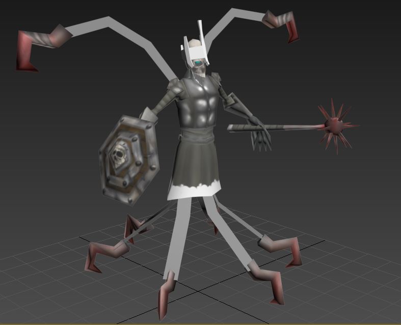
Here's the first WIP of the texture.
The white is alpha channel. (Transparency.) In game it will be see through.
I'm also going to create a high def portrait. I'm going to up the triangle count to 1500 or so just for the portrait, and I will also include a higher quality texture. This portrait will be an optional model that I will submit separately. The primary model will have a portrait camera if you don't want the separate portrait.
stonneash, how are you viewing the model? Because it doesn't display like that in WC3 or the model editor for me.
K, just checked it in the site's viewer, it doesn't display correctly in it.
The lich doesnt resemble the necromancer too, still, its used as an example. This model fits as much as a lich does too, and I like it.
Gonna be in holidays for 2 weeks. Gonna scrap the bloodelf again and create concepts in mx free time. Lets see if I manage to create a model in the last few remaining weeks then.
that remembered me an issue about separate potrait and polycount in a past competition...
having a high-poly portrait many times means optimizing the model. because the game engine draws 2 models - one on the map and one in the portrait. if you use the same model to both the engine will draw legs and arms and stuff at the portrait, which are all unecessary polies.
so having a high-poly potrait means smart usage of polygons.
It's not that much of a deal. Remember that only one copy of the portrait is drawn, while the model is drawn as many times as objects are in the visible screen.
Also most GPU cards now a days won't draw faces which shouldn't be visible on the viewport. The only thing that may happen is the overhead caused by skeletical animations and other not gpu related processing.
To Supa:
I saw some details on your model. First it lacks collision shapes and event objects. I imagine you also want sounds in the model and footprints, atleast sounds for death and dissipate. You should also make the glows scale up and scale down all the time to look more active (look at hero paladin sample) and make them unselectable (Object Settings -> Mesh -> Unselectable) so NeoDex calculates with more precision your model's selection area. as for the rest, it's looking wite great, except for hook not blending naturally all the time.
Hmm, as a last suggestion, add billboarding glows to the hook and add a glow background (none additive) that's only visible during portrait animations.
It's not that much of a deal. Remember that only one copy of the portrait is drawn, while the model is drawn as many times as objects are in the visible screen.
Also most GPU cards now a days won't draw faces which shouldn't be visible on the viewport. The only thing that may happen is the overhead cause by skeletical animations and other not gpu related processing.
what made me mention it is that there was a contest in the past about low polycount, and people were about to sum up portrait polycount + model polycount, as if portrait was extra polycount. and that's a mistake.
what you mentioned about the portrait being always 1 single model and the unit being potentially many simultaneous models makes it even more clear we shouldn't see portraits as "polycount luxury".
that whole polycount talk doesn't make that much sense nowadays, but it's took into account by judges and mods and stuff, even if it's for keeping the model in-context.
Polycount talk actualy still makes sense. The thing is that numbers have changed and there are better tactics for processing more polies. Even Sc2 has a poly mark (between 1300 and 8000, depending on how massive should the unit be)
In the case of wc3, i think units shouldn't pass the 1350 polies mark. It's not because of computer now a days it's because of accessibility. Many people have integrated gpus which are very slow and play warcraft because it's the only thing they can run on them. It's quite normal that people use notebooks now a days with integrated gpus. Only artists, hardcore gamers and people who can afford high end laptops, do actualy have good GPUs on their laptops.
All the models are awesome, but the best model for me is Wandering Soul; Sentinels Gereral / PROXY / SuPa-
but the best one is the model made by AnemicRoyalty (A.R.) , just perfect *-*
Here's another quick WIP of the texture.
You can't see team color right now, but it is there on the two metal bands on the shield, the handle of the mace, and the cloth wraps on the upper two hooks.
I just have to finish the rest of the texture and then perfect the blood and the bracers.
You might have noticed I also downsized the spikes. Looks better that way.
The texture as is needs way more contrast and color to provide interest. Right now the spectrum is from dark gray to light gray. Improve on that and it'll look much better
I was thinking of adding in some gold borders on the shoulders and armor. That might help.
Before I do any of that though, I'm going to completely finish the texture as it is and then refine it.
Here's another quick WIP of the texture.
You can't see team color right now, but it is there on the two metal bands on the shield, the handle of the mace, and the cloth wraps on the upper two hooks.
I just have to finish the rest of the texture and then perfect the blood and the bracers.
You might have noticed I also downsized the spikes. Looks better that way.
Interesting. While I love the Firelord's crown/helmet, and think it's a good addition to your Orc... Don't you think it was spiky enough to start?!
Also, I think the Beastmaster texture is a great way to go (like you said, for the wooly-stuff Orcs so love to dress up in). Please also consider retexturing the armor... To be more defined, if nothing else.
Here's another quick WIP of the texture.
You can't see team color right now, but it is there on the two metal bands on the shield, the handle of the mace, and the cloth wraps on the upper two hooks.
I just have to finish the rest of the texture and then perfect the blood and the bracers.
You might have noticed I also downsized the spikes. Looks better that way.
Yes, smaller spikes was one of my issues with the last one (but I didn't want to keep demoralizing you. ).
I agree with BlinkBoy; the texturing is great, the artistry is smooth & delicious... But it's really more fitting to the Diablo-verse than the Warcraft-verse. Somber, subdued tones, little variation... Warcraft has high-contrast, loud/bright colors, ridiculously-over-the-top... etc.
Sometimes I wonder if you missed your true calling in life; modding Diablo. xD
But again, I'm liking it, and the texture is helping it come together.
Kenntaur said:
i was thinking of joining so here's the first wip of my revenant
Agh! You guys! Stop it, new guys. Coming out of the woodwork with fancy meshes is entirely inappropriate.
Lookin' real good. Almost, too good... That's a rather smooth mesh for Wc3. But I'll give it time; this is a very early WIP. Anyway, you'll have to work hard to win my heart from WhiteDeath's "hero revenant", but good luck.
(Also, kudos on the Markiplier avatar. He's pretty funny)
stonneash said:
Alot of minor mesh edit and added horns on face, added a shoulder pad, and few spikes on arm 2 right, Am thinking if removing the staff, and make him somehow float with shadow particles.
+ Added horns
+ Minor mesh edits
+ Arm and shoulder pads
+ No staff
+ Rewraped from scratch
Not bad, doing better for sure. I like some of the additions (straps on the arm/feet, interesting staff, nice eyes). However, I'm going to warn you that his entire core (upper legs/torso/head) is going to look like a gray, cloudy mess from in-game.
First off, the regular Orcish skin, as bright green as it is, is done so to stand out. This guy's is all smoky and black (I know he's a "shadow shaman", but you can't sacrifice "cool" for "fitting-ness" or "clarity". Just like AR). Secondly, the fur/armor on the body & such is still a big furry mess... The straps on hands & feet really help define the armor, so try something similar?
Gonna be in holidays for 2 weeks. Gonna scrap the bloodelf again and create concepts in mx free time. Lets see if I manage to create a model in the last few remaining weeks then.
Today I learned my texturing is smooth and delicious.
You know, funny. I've always loved Diablo. Diablo 1 was one of my favorite games of all time. I have also wanted to at some point create a stylized, hand painted, atmospheric, diablo esque warcraft 3 mod. It would be really fun making models for something like that.
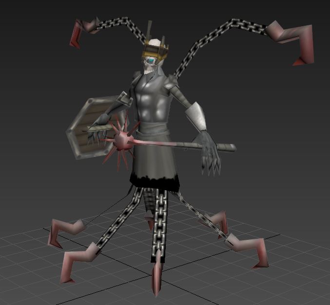
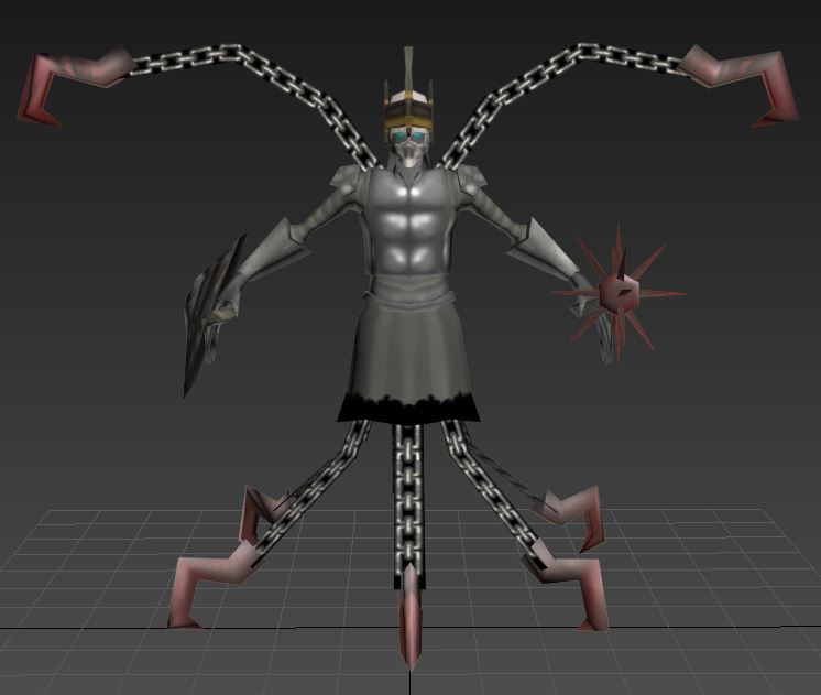
Alright, texture is mostly finished except for a few tweaks here and there.
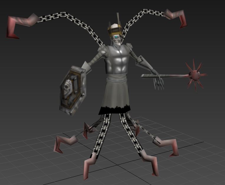
Here's a sketchfab of the model. Keep in mind team color and alpha channels are not operational in this viewer. Black is an alpha channel. Team color is on the wraps on the upper two hooks, the outer two metal rungs on the face of the shield, and the handle of the mace. It cannot be currently seen at all.
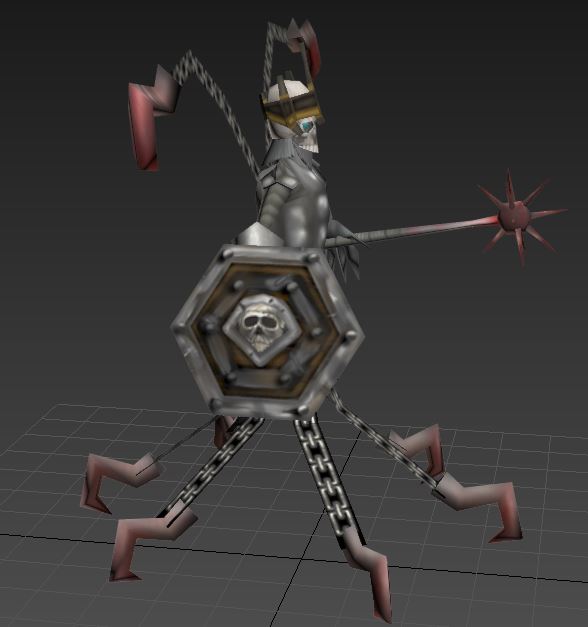
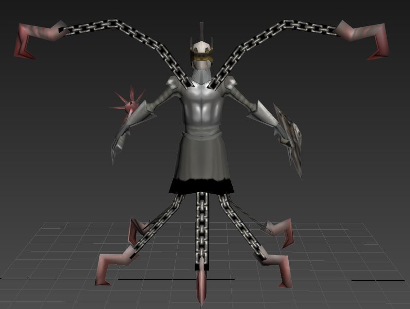
Incase you can't view it on sketchfab here are a few screenies.
Next is rigging. Should be quite the task, he's gonna need somewhere around 40 bones and several helpers from my latest calculations. Fortunately 40 isn't that much higher than the recommended bone count for units such as this in the art tools documentation. And that was made a long time ago, so I don't think it should cause any kind of issue.
I'm really liking the texture on the shield and crown, but everything else still looks drowned out and gray. Especially the breastplate and skirt, as well as the skull itself.
You really should introduce more colors to the texture. It will make it look much better.
True enough. I think the skull is ok, but I could add a couple more colors here and there and define it a bit more. I'm not going to spend to much more time on it though.
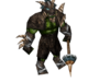
Continued with the experiment. Realized that wc3 models always has two sets of geosets for their models. Removed the parts I didn't need and made the firelord stuff look wooly. Because reasons.
Yes, that looks dwarvish. Barbarian/Norse wools are pretty viking-ish or dwarvish, Orcs are better with non-european spikes and brutish strength. (No to leather clothes!)
Yes, that looks dwarvish. Barbarian/Norse wools are pretty viking-ish or dwarvish, Orcs are better with non-european spikes and brutish strength. (No to leather clothes!)
Not much, I'm kinda playing up the Illusionist/Enchantress angle with the purple spell effects (makes her different from BM/Priest). The one I'm using for testing has a hero version of the Wand of Illusion spell but that's mostly just for kicks
This site uses cookies to help personalise content, tailor your experience and to keep you logged in if you register.
By continuing to use this site, you are consenting to our use of cookies.


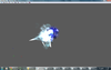
 Am no sure if its suppsed to be like this