did some retexturing, remapping, replacing... alot of "re"
I'm also currently learning animation from Retera, so expect it to have a new animation soon
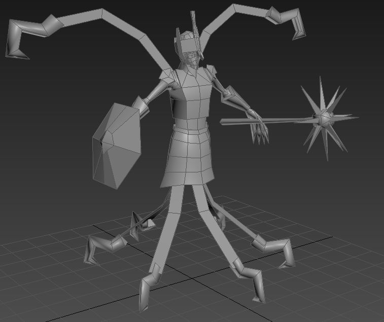
I'm brainstorming on what kind of replacement is suitable for the whole arm, I want to change the arm because it very much resembles the unit =/
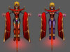
Not bad, definitely coming along. I'm a little surprised you kept the ultra-crown-of-swords Weapon; I dunno, maybe seeing it in-game won't be so bad.
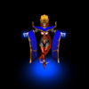
In fact, I'd like to make that an official request; can you give us at least a picture or two that
isn't zoomed into his nostril?

Lol, but seriously, your model fills the whole screen, which is good for seeing details (keep doing that), but seeing a little bit of color around the edge (zoom out a bit in Magos, then take a screenshot & crop it) would really help get a feel for his proportions. That, and/or the same thing but from an actual in-game perspective (since I know it'd be a hassle to upload it into the WE everytime you wanted to take a pic).
Just a suggestion.
Along with that, I like what you've got, and look forward to some custom animations. I would highly suggest some changes along those lines, to really emphasize the differences between the unit & the hero. I look at in-game pics, and I see the
cool concept art you appear to be going from... I love Samwise's art, but have to admit it's not truly as full of character as Hero might be.
Differently-shaped helmet/head, perhaps? Modified skin color? Actual eyes?
Hello guys, I have learnt animating is 3ds max so maybe I will join.
One question: we need to create new version of some wc3 model? For excample new tauren chiften?
~~~
I did, but I never understand it
. That is my main problem.
Hum, really? Yeah, I did my best to not only provide some really big detailed explanations, but also a variety of pictures (First and Second Posts) and a nice simple explanation at the very top in blue. :<
Take any in-game unit and make a Hero-version of it. DON'T just take the footman, add hero glow & a longer sword, for example.
Examples:
Take a Footman and make a Gladiator
Take the Tornado and make a Wind Lord
Take Witch Doctor and make a Medicine Mon
Etc. Post here if you need some (more) ideas.
So that raises the question; can my explanation be simplified? What didn't you understand?
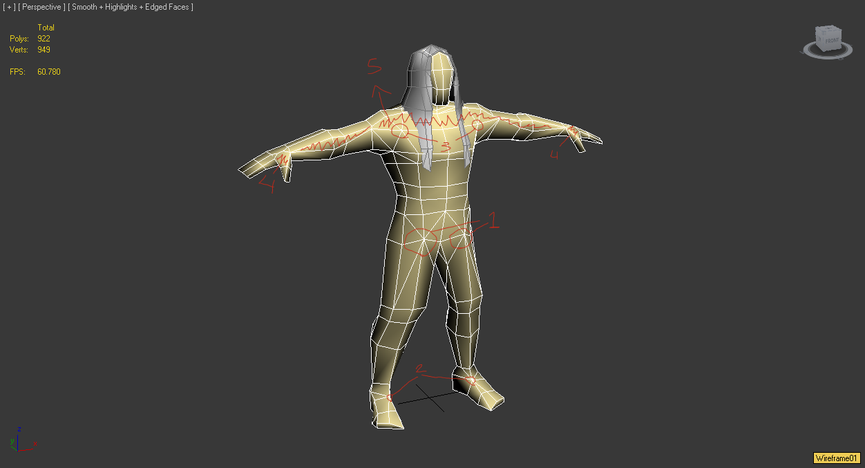
I have a question, will I get a lower score when it comes time for judging if I have missing faces on the inside of the skull helmet where they can't be seen to reduce poly count?
Shouldn't, but I suppose... Hum. On the one hand, you're right, Blizzard has made tons of little model gaffes, so if this is made to fit Blizzard, there's a bit of room for error. However, does that you mean you intentionally allow faults & errors in, or neglect proper modeling practices? I should think not... If anything, making something correctly (i.e. better than Blizzard, but still fitting the style) should be the goal.
But yeah, inside the helmet seems like a waste. I'd be surprised to see you graded off on that.
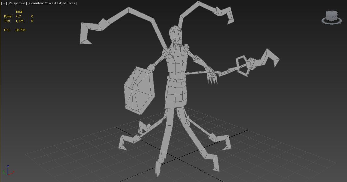
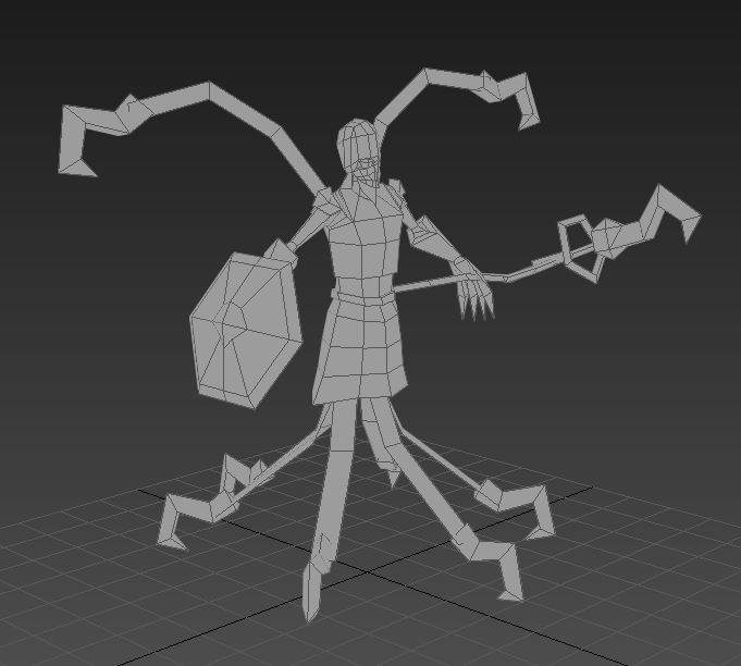
Ok, I bulked up his bracers, and slightly his upper arms, his entire upper torso got bigger, I changed the shape of his kilt slightly, and I removed about 50 triangles worth of unneeded polys.
It helped alot. I don't know If I want to add anything else. It might overcrowd the model.
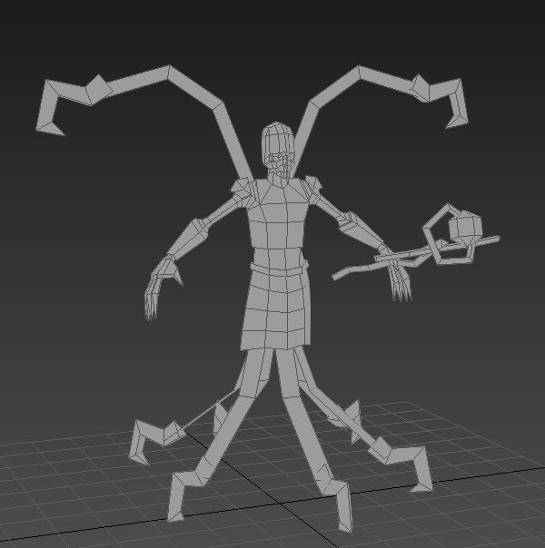
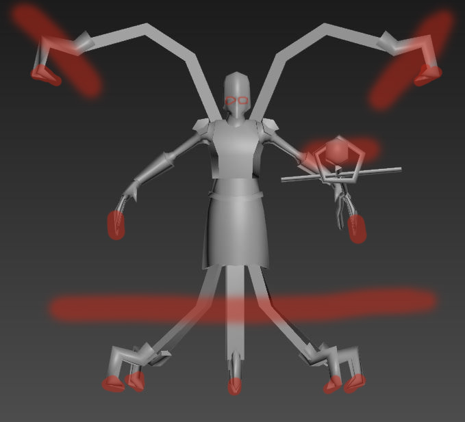
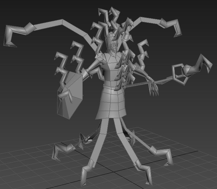
I'm gonna have to agree with Deolrin a lot here... It's definitely looking better, but there's a certain "OOMPH". It might just be all those hooks; I look at it and I see 'hook-hook-hook-hook-hook...". In fact, it's almost more like a Meat Wagon hero than a Necromancer hero
The Lich has the "pharaoh" vibe, which is emphasized by the HUGE ceremonial head-dress behind him.
Now since you're trying to differentiate him from the Lich, I would avoid that... But something else huge on his back/head... Horns? Coffin? library of evil books? Flowing tatters of cape? Um.
Also, what a cute buckler.