I'll comment on this single screenshot, as if it were, let's say a submission to a contest, even if I might give some more extra points, since there are no other contestants and as a small motivation to keep going
") Artistic Aspects: Atmosphere: 10/15
Artistic Aspects: Atmosphere: 10/15
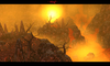
This is really an update to your previous pictures. The Hell begins to become intense, by looking at it, I can actually feel how hot it is in there. The floating rocks give a nice touch-up to the atmosphere as well. What still bothers me is the use of water as lava, this causes me not to give more points here. I guess, changing the lave would really upgrade the atmosphere in here.
One other thing is not good about the atmosphere: You can actually see the end of the world (or in this case "hell"). But honestly, I think of a hell as a deep cave, something under the earth, but for sure not something on which flat end, I can see a sky. But more about this in the techniqual aspect of this review.
Creativity: 3/5 (normal rating 1/5)Hell yeah, hell terrains aren't creative after the last terraining contest at all. SO normally I cannot give a high rating here. But considering this as a playable terrain for your project I won't judge on this aspect to much. What is creative for me is the use of Kael and the dragon in a way I cannot really describe, it's just not the standard way of a hell. Apart from that it's a standard Hell terrian though.
Technical: Doodadplacement: 6/12
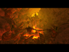
This however is one of the still major flaws of the Terrain. Here are a lot of things to mention that could be improved. TO pick out one first: You spamed wooden doodads into a HELL!!! and also into LAVA!!! You now what happens to wood, when coming in touch with fire I guess
So I suggest you to get rid of those wooden boxes and other stuff to make your terrain more realistic. Also I strongly suggest you a - let me say - trick for more experienced users: Copy the rocks that you use in Object Editor to get another Rock, now use Pitch and Roll angle to change his look and place it right to your other rocks. This does help you, so that not all your rocks look straight into the sky!
Tilevariation/Heightvariation: 5/6
Another good point of your terrain: the tilevariation 3/3 here. It's really well done, I love how you used those lava cracks around the isles, no concern here! The heighvariation has no major flaw either. But the island looks a bit flat to me, anyways, it's acceptable for sure.
Other Stylistic Things/Use of FITTING doodads: 5/10
It's obvious that you are not that experienced as a terrainer yet, since some tricks of experienced terrainers can not be seen in here. So I now tell one, which I already suggested before: Piwlady's lava tutorial! Using Water as lava is just not the same. But now away from that. The flames (I don't know the english translation) "traps" are not really realistic. A well made fire that I suggest to use in your terrain is this:
http://www.hiveworkshop.com/forums/models-530/firemedium-52452/?prev=search=fire&d=list&r=20
I suggest to remove all other fire
OVERALL: 29/48
This might be just another Hell terrain which seems to be an average terrain. But considering you're not yet that experienced this is a good start and with the already named touch-ups this should turn out to be a very nice Hell, HELL YEAH!
Keep it up! And keep the updates coming!
M0rbid